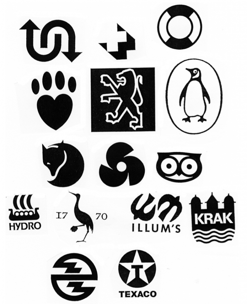
Be conscious about these points at logo design.
1. The size. Does the logo work in small? Thin lines and small
details risk blurring when the logo is minimized.
2. Trendy styles. Does the logo contain trendy style elements?
It can be ok for the young age group, but the logo will seem old
fashion in a short time.
3. Medias. Does the logo work in every media? It’s not enough the
logo looks great on the screen. The ultimate logo should be
copied in a copy machine without damaging loss of quality.
Therefore consider the use of gradations and many colour
values. 3-D and shadow effects are hard to reproduce in every
media. The good logo will work in pure black and white.
4. Identity. Does the logo reflect the identity of the company?
5. Simplicity. Is the logo simple and easy to remember? It has to
be that. A quick reading must be possible.
6. Outstanding. Is the logo unique? Is the idea used before?
Some ideas are used millions of times. For instance the eye and
the globe.

Simplicity
This is the kind of simplicity that we aim for well working trademark
design.